Crunch Culture
Visual Identity
This project involved creating a graphic profile for the fictional company Crunch Culture, which produces organically sustainable granola. The work included development of the company’s identity, logo, packaging design, business cards and a brand guide for the client.
Crunch Culture is a fictional company with a focus on environmental awareness and taste experiences. The starting point of the project was to create a graphic profile that communicates the company’s values in a playful way, without alienating target groups who do not typically prioritize organic choices.
Year:
2023
Type of work:
Visual identity
Tags:
Graphic design, Package design, Logotype, Branding
Tools:
Illustrator, Photoshop InDesign
Pre-study & Process
The project began with an extensive background analysis to define the company’s vision, goals and target audience. Sketching the logo was the first creative step, where multiple ideas were developed under time pressure to stimulate creativity. The strongest concepts were then digitized, and colors and shapes were refined iteratively.
The packaging design process started with inspiration research and hand sketches. The focus was on creating a layout that stands out on store shelves while reflecting the company’s values. The layout combines playfulness with structure, integrating the rule of thirds and subtle nature-inspired colors. The business cards were designed with the same approach, resulting in a clean and universally applicable design.
Results
Color palette
The color palette was developed to clearly represent the brand’s stance and values. The colors complement each other and can be combined in multiple ways.
Many of the colors are strongly inspired by nature and earth tones, which are then complemented by two accent colors to capture the viewer’s interest.
Logo
The primary logo consists of a custom-designed typeface combined with Bebas Neue Regular and the symbol representing the company.
The logo blends organic and playful shapes with more rigid forms to create a serious yet approachable expression.
The color choices symbolize the brand’s core values while also being associated with granola.
Secondary logo
The secondary logo combines elements from the primary logo and provides a more minimal expression without losing brand recognition. It also works well at small sizes.
Having an additional option creates greater flexibility within the visual identity. When the primary logo does not fit, the secondary logo serves as an excellent alternative.
Like the primary logo, this version can be used both in full color and as a single-color mark.
Icon
The symbol acts as a visual signature for the brand and appears throughout the graphic profile. It is especially effective on surfaces that are too small for the primary or secondary logo.
The symbol is inspired by the shape of a wheat sprout, directly referencing the origin of granola in the brand’s visual identity.
The organic form also evokes shapes found in nature and therefore serves as a symbol of the brand’s commitment to protecting the planet.
Typography
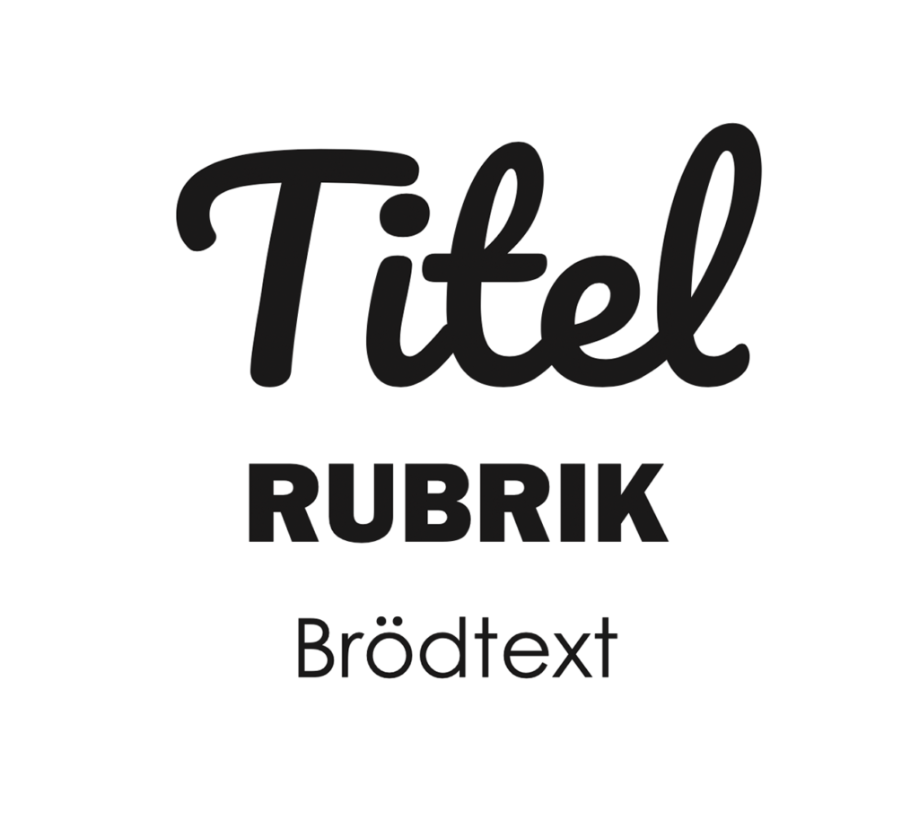
Title – Pacifico Regular
Pacifico Regular is a script typeface that conveys the feeling that the granola is made with care and craftsmanship, giving the brand a more authentic expression. This typeface is used for titles that should stand out from the rest of the text, such as granola flavors.
Heading – Franklin Gothic Heavy
Franklin Gothic is a strong typeface that draws attention while also communicating the brand’s passion. This typeface, set in uppercase, is used for headings such as website sections and similar elements.
Body text – Century Gothic
Century Gothic is a sans-serif typeface that gives the brand a modern feel. It is also a standard font on most computers, making it suitable for web-based material. This typeface is used for body text on packaging and the website, and can be applied in both bold and regular weights.
Packaging
The packaging brings together all elements of the visual identity into a cohesive whole. Here, all components are shown in use and how they work together.
It also features a custom-designed pattern on the front, where different berries can easily be replaced with illustrations for future flavors.
The sand-colored section is both practical and environmentally friendly, as it does not require dyeing.
Final thoughts
The project provided valuable experience in design and brand building. The biggest challenge was creating a pitch that summarized the work in a clear and persuasive way. The result is a cohesive graphic profile that fulfills the company’s vision and appeals to a broader audience. The project has inspired future work with an even deeper understanding of design processes and brand communication.