Mgmt is a consulting firm operating at the intersection of technology and management. The project was a full-scope assignment covering reserach, strategy, visual identity and a complete website built in Webflow.
GOAL : The goal was to create a more modern, human and action-oriented expression that clearly communicates Mgmt’s values and expertise to two key audiences: clients and candidates.
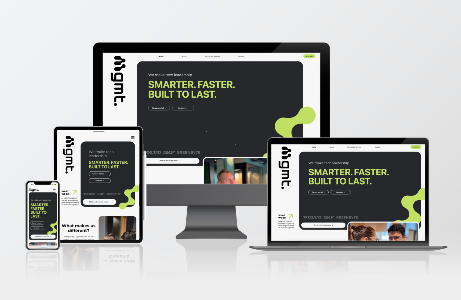
RESULT : The project resulted in a cohesive brand identity and a fully launched website that replaced a previously hard-to-navigate solution with a clear information structure and improved search discoverability. The new platform provides a stronger foundation for both business development and recruitment, positioning Mgmt as a contemporary and human-centered consulting firm.
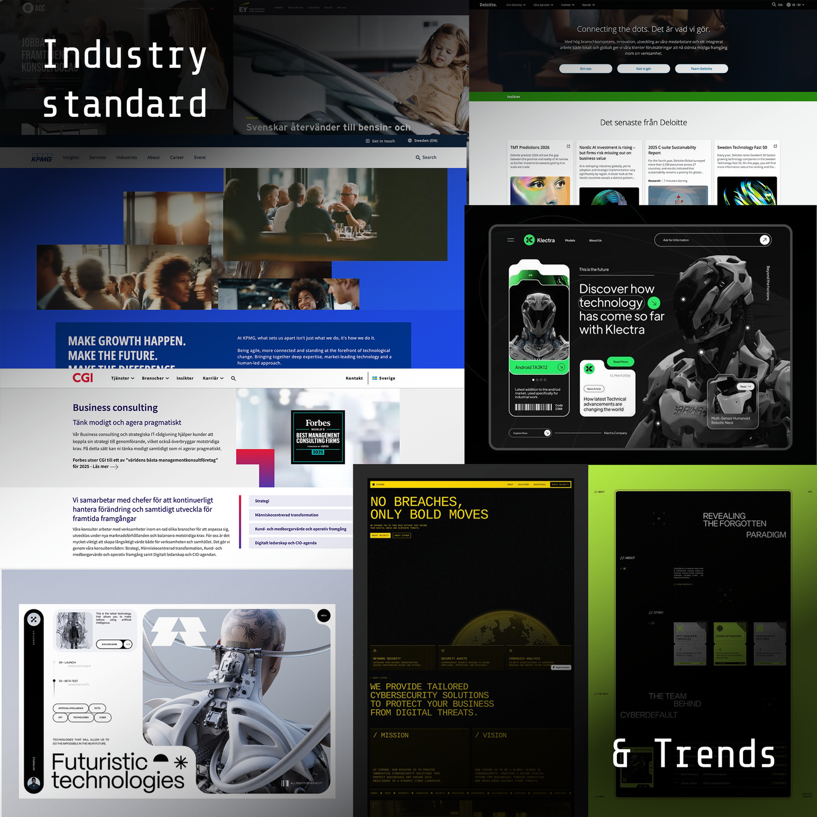
The project began with a competitive landscape and trend analysis to map current expressions within the technology, management and consulting sectors. The analysis showed that many competitors followed traditional and generic visual influences, often using dark color palettes, formal tonality and static layouts.
This opened up an opportunity to position Mgmt as a more future-oriented and human-centered player. During the research, an emerging futuristic aesthetic was also identified, emphasizing contrasts, movement and technically inspired grid structures. This trend sparked interest as a way to position Mgmt as forward-thinking and innovative.
These early insights formed the foundation for discussions around Mgmt’s visual tonality in the upcoming workshop.
From strategy to creative direction
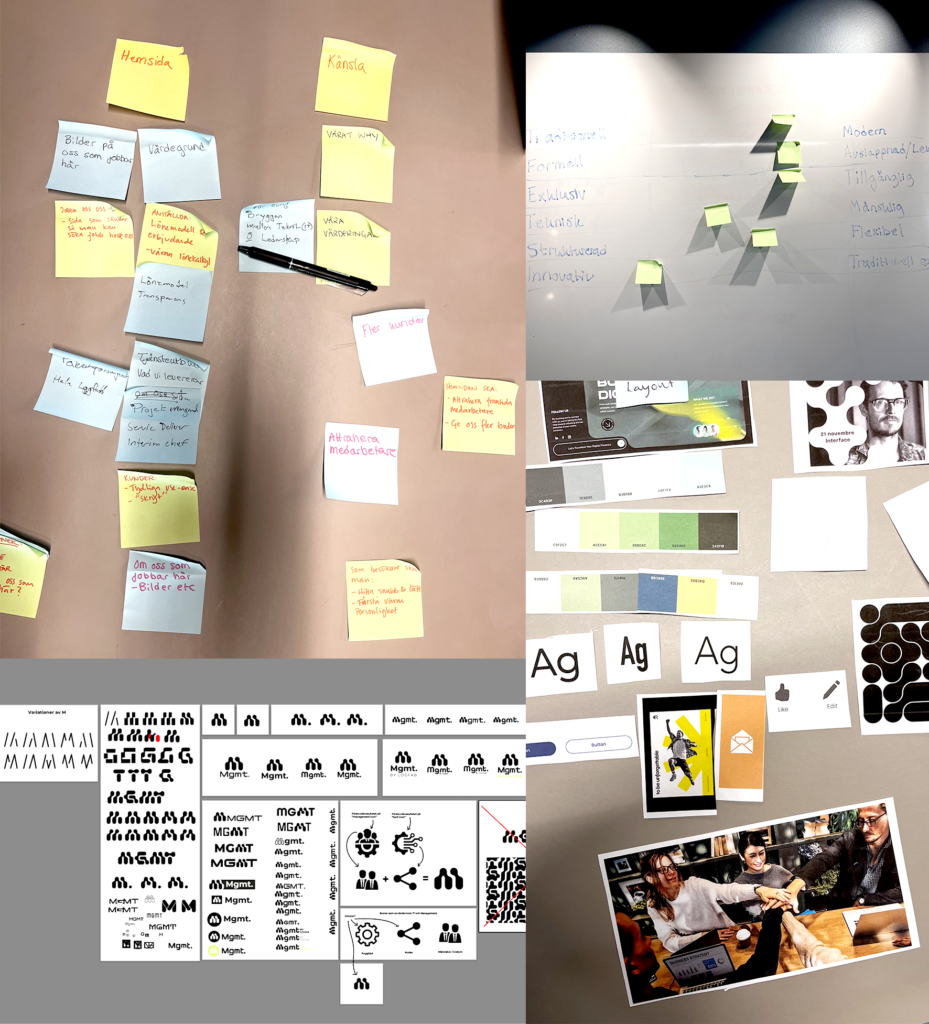
After the initial research phase, a joint brand workshop was held with Mgmt’s leadership and employees. The goal was to identify the company’s core values, personality and visual expression. Through exercises with opposites, priority and value mapping, future scenarios and moodboards, we explored what Mgmt stands for and how this can be conveyed visually.
It became clear that Mgmt wants to be perceived as relaxed yet professional, forward-looking and genuine – a company that combines technical expertise with human connection. The team emphasized the importance of avoiding a distant and overly formal expression in favor of authenticity, clarity and movement.
During the analysis after the workshop, it also became evident that the futuristic aesthetic needed to be balanced with something warmer and more organic. We landed on a direction where softer shapes and lighter colors meet clean typography and clear structure, creating a combination that feels modern and professional.
The workshop results led to five central guidelines:
Highlight purpose and values early in the communication.
Show the bridge between technology and people in both tone and visual form.
Create variation and rhythm in the layout to reflect energy and flexibility.
Simplify the path to understanding by creating a clear structure and navigation flow.
Embrace a more futuristic and dynamic visual language with organic forms and strong contrasts.
Design development and execution
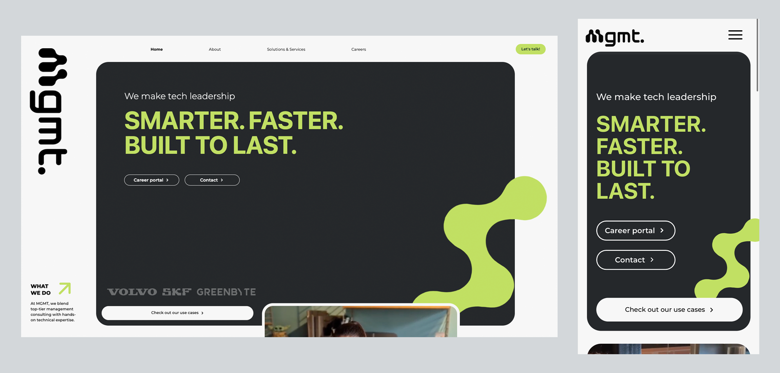
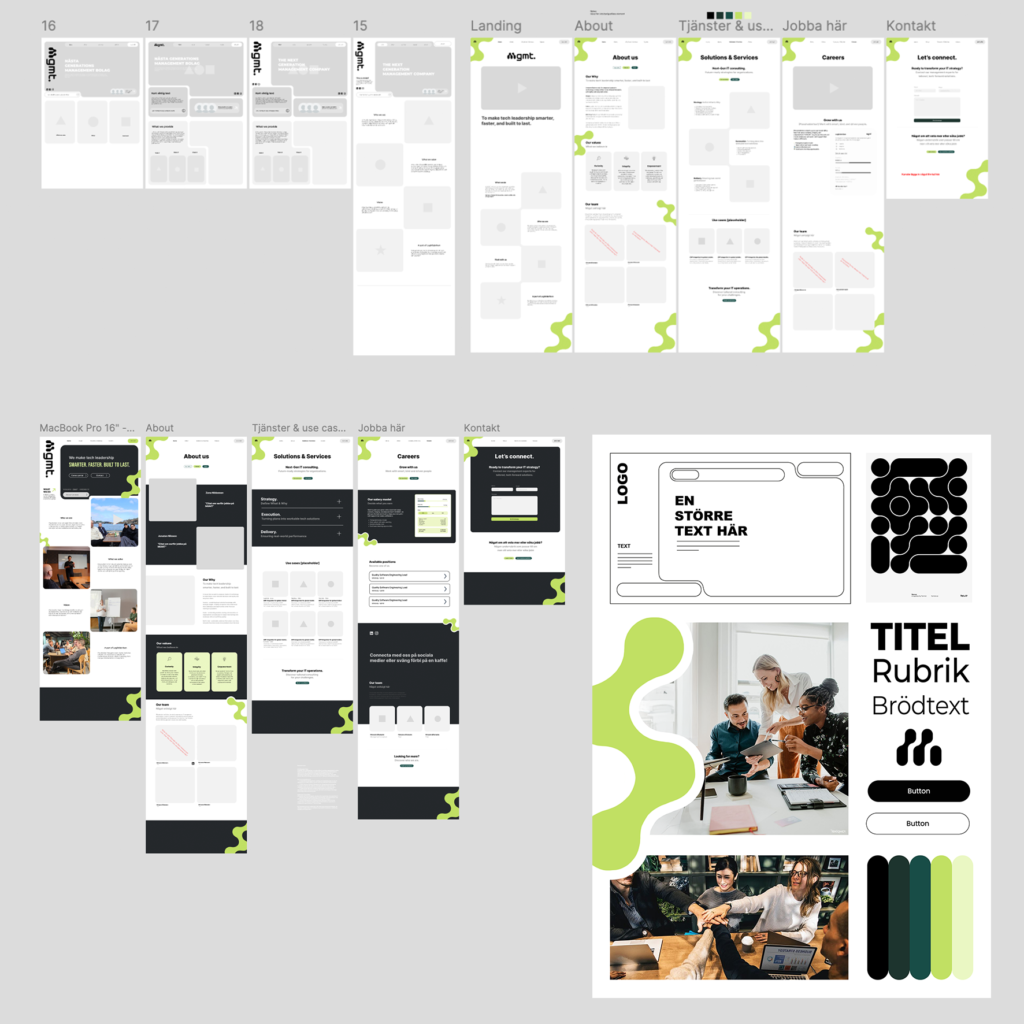
With these insights as a foundation, moodboards and UI concepts were created in Figma. Several visual directions were tested, where light color palettes, organic forms and human-centered imagery were balanced against futuristic details, modern sans-serif typography and structured layouts. The result was a warm, modern and trustworthy identity that differentiates Mgmt from other actors in the industry.
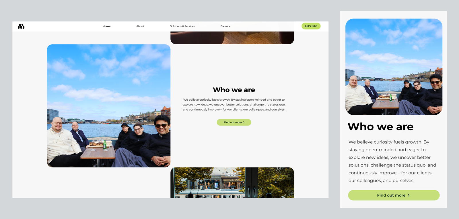
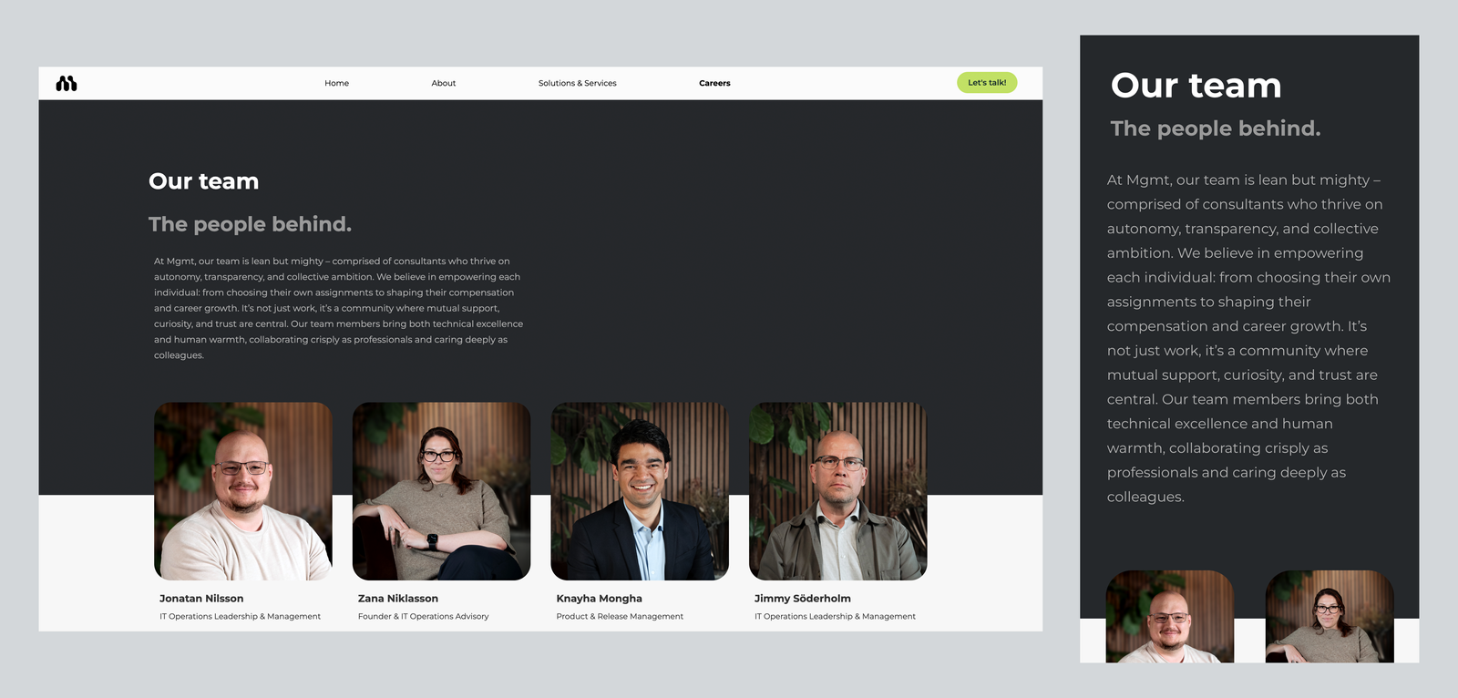
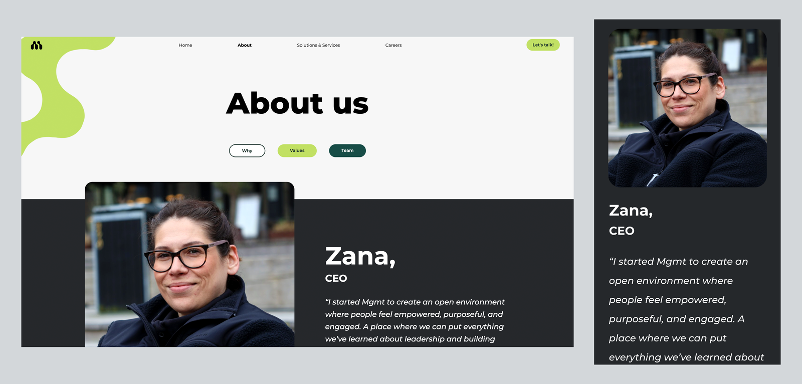
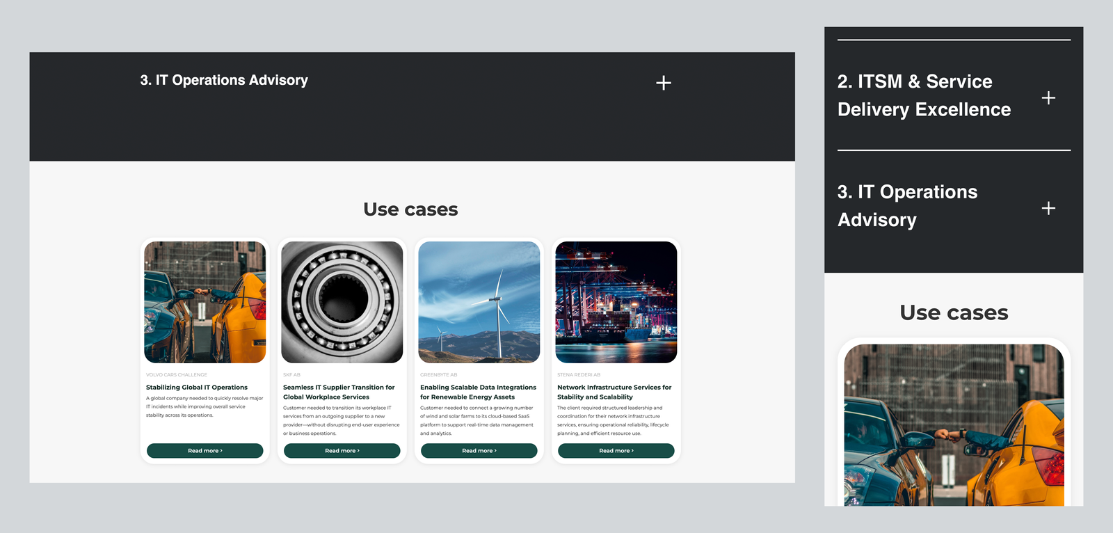
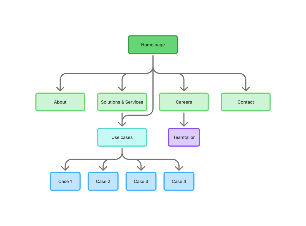
As an unclear navigation flow was a weakness in the previous design, the information architecture was built around five pages. Each page was designed with a focus on clear hierarchy, relevant content and communication tailored to target groups.
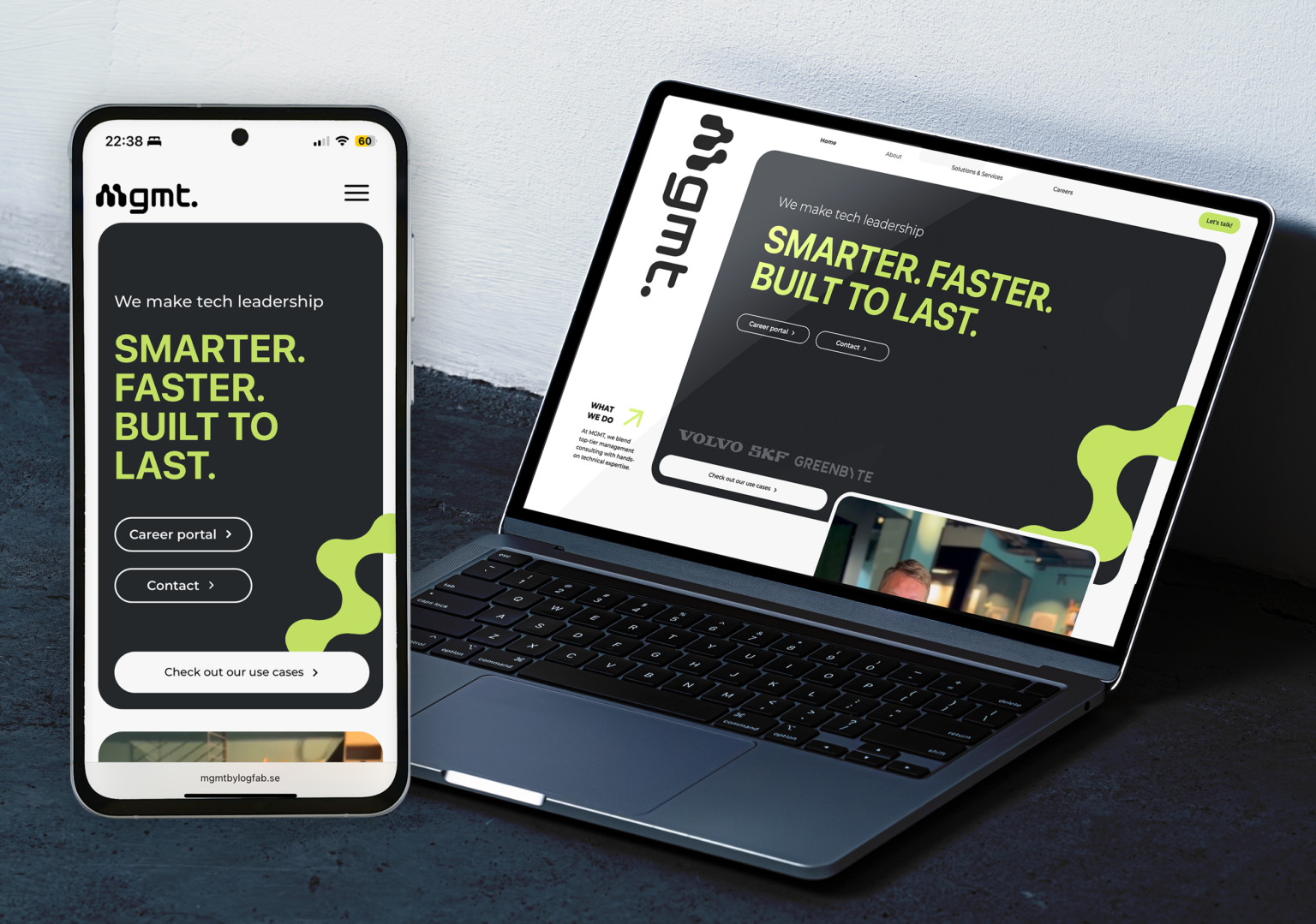
When wireframes and design direction were established, the entire website was implemented in Webflow, enabling a responsive, dynamic and maintainable solution. The platform also provided flexibility to test micro-interactions and adjust content in real time during development.
Results
Delivered outcome
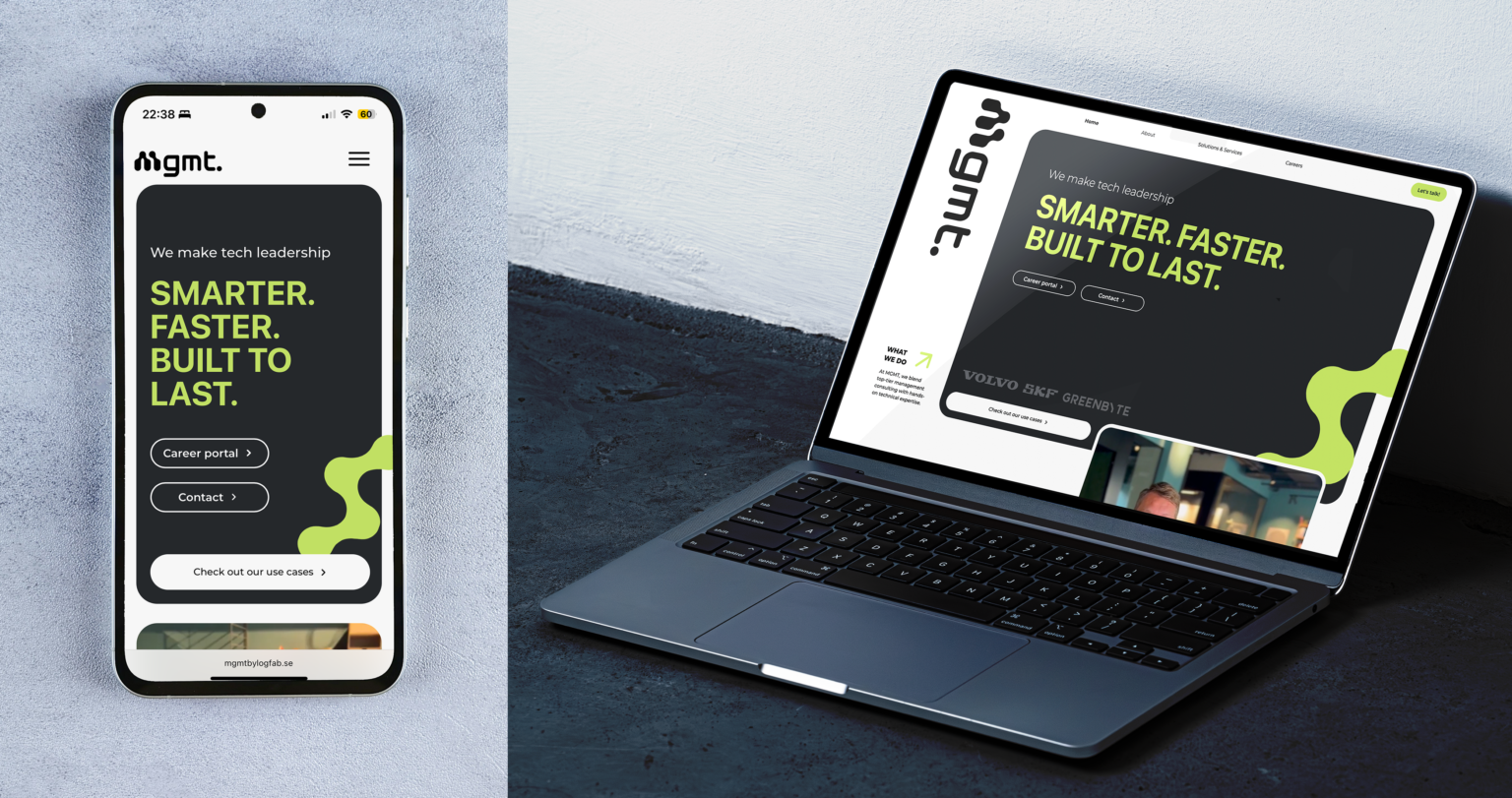
The project resulted in a cohesive brand identity system and a fully launched website, replacing a previously unclear and outdated digital presence with a structured, accessible and modern solution.
The delivery included:
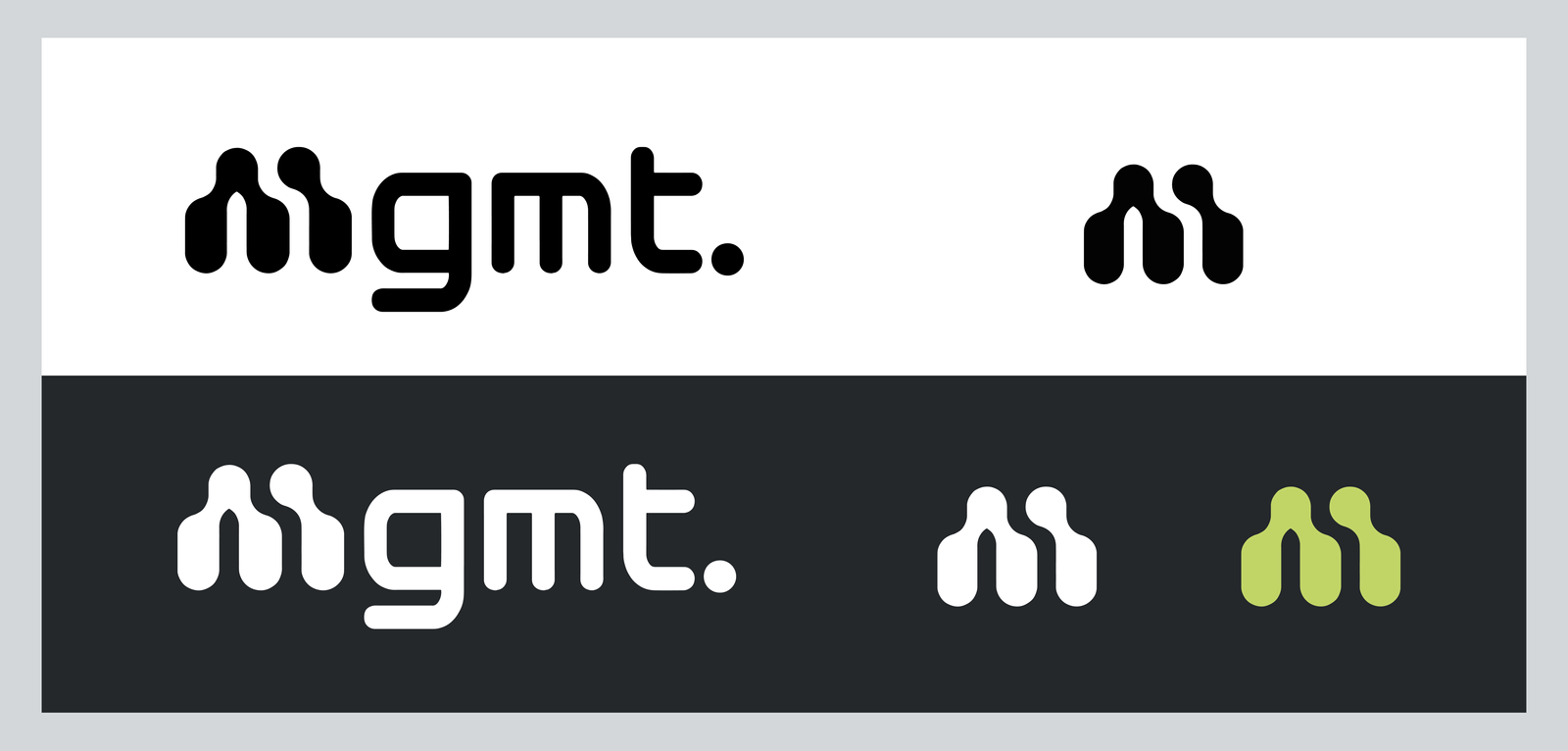
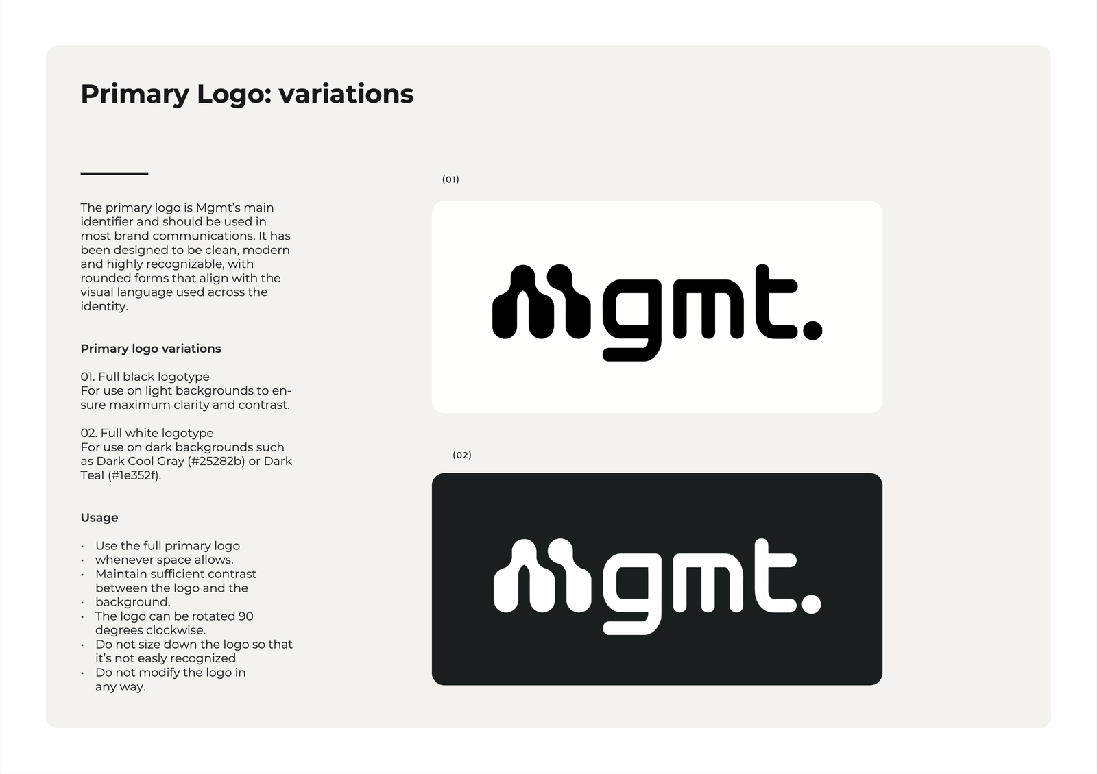
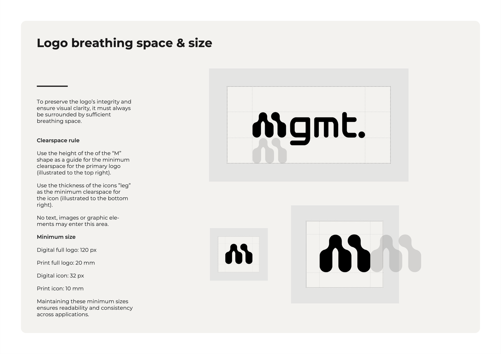
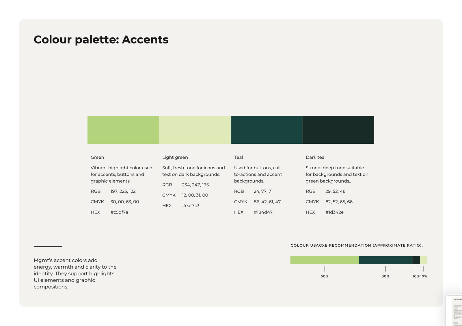
A complete visual identity system (logo, color palette, typography and graphic elements)
Brand guidelines defining tone, imagery, layout principles and correct usage across channels
A redesigned information architecture supporting both clients and candidates
A fully built Webflow website with responsive layouts and integrated CMS
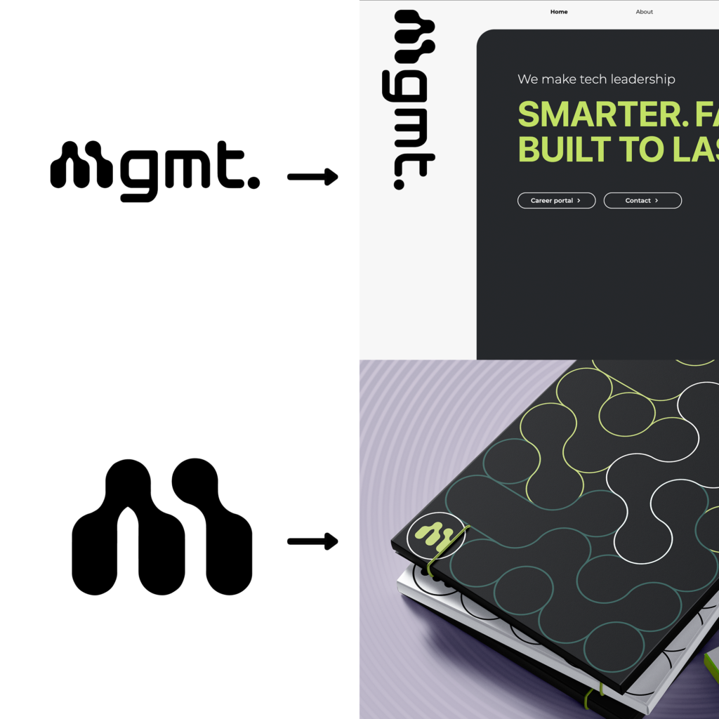
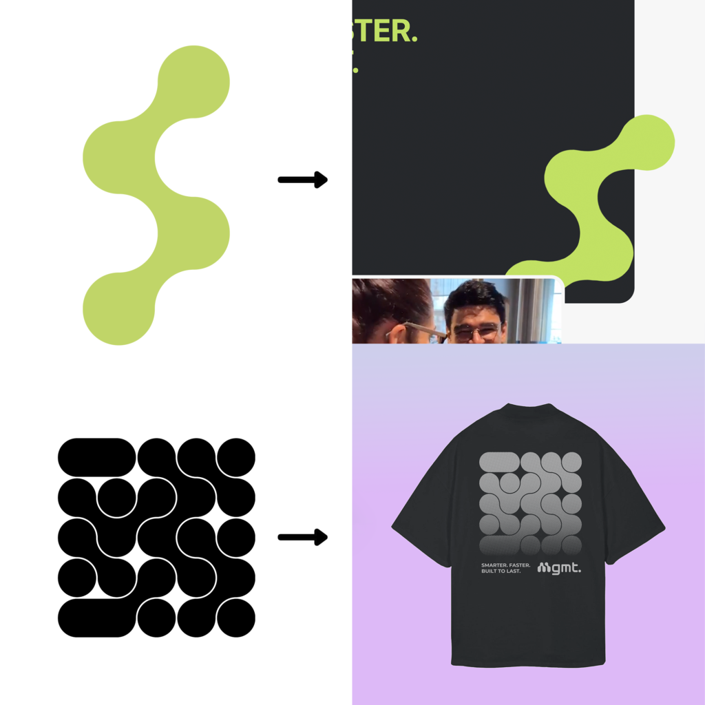
Below is selected slides from the brand style guide.
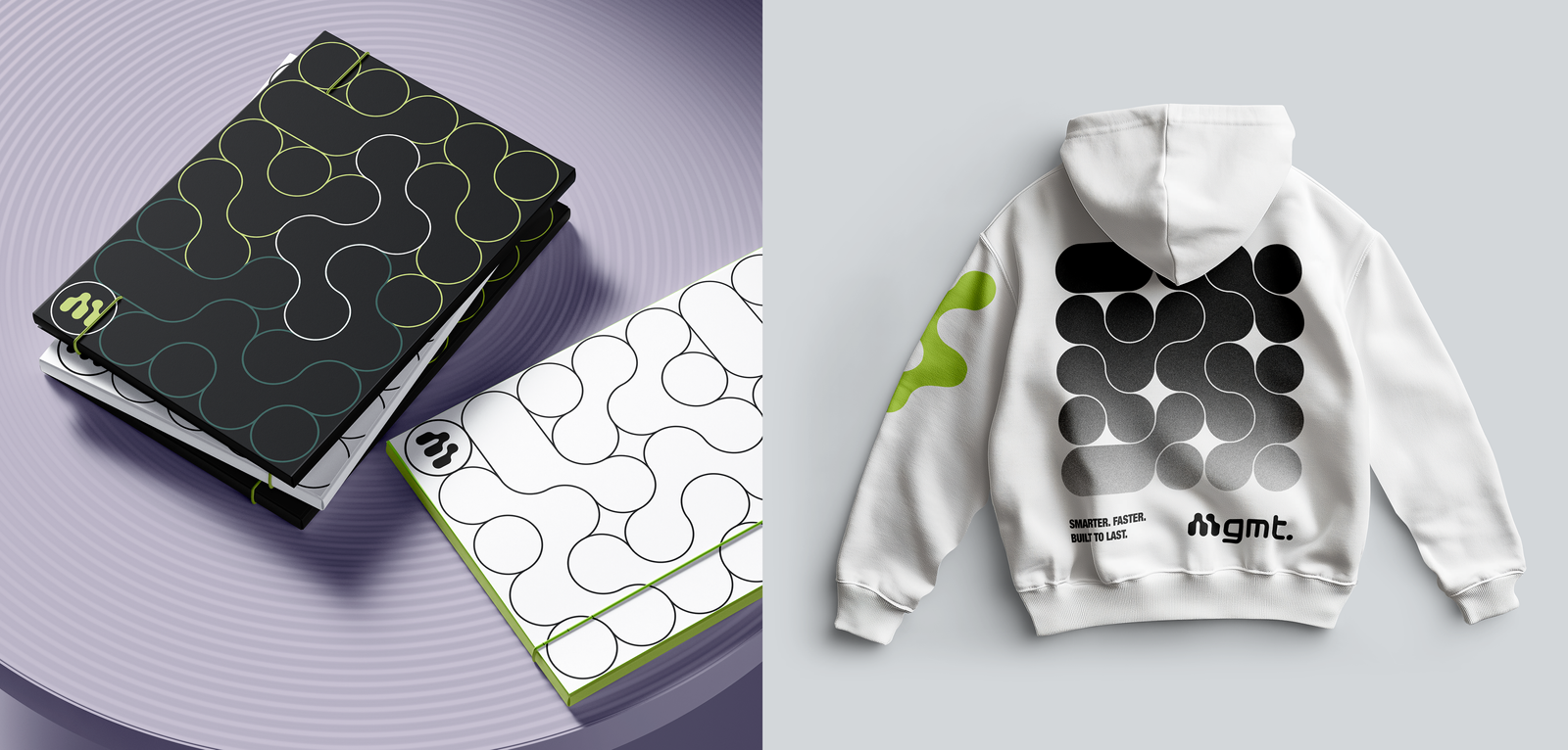
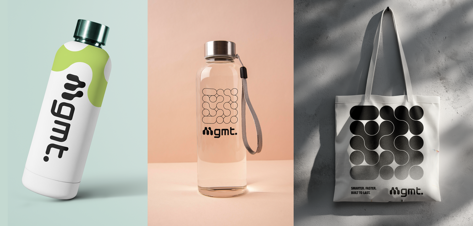
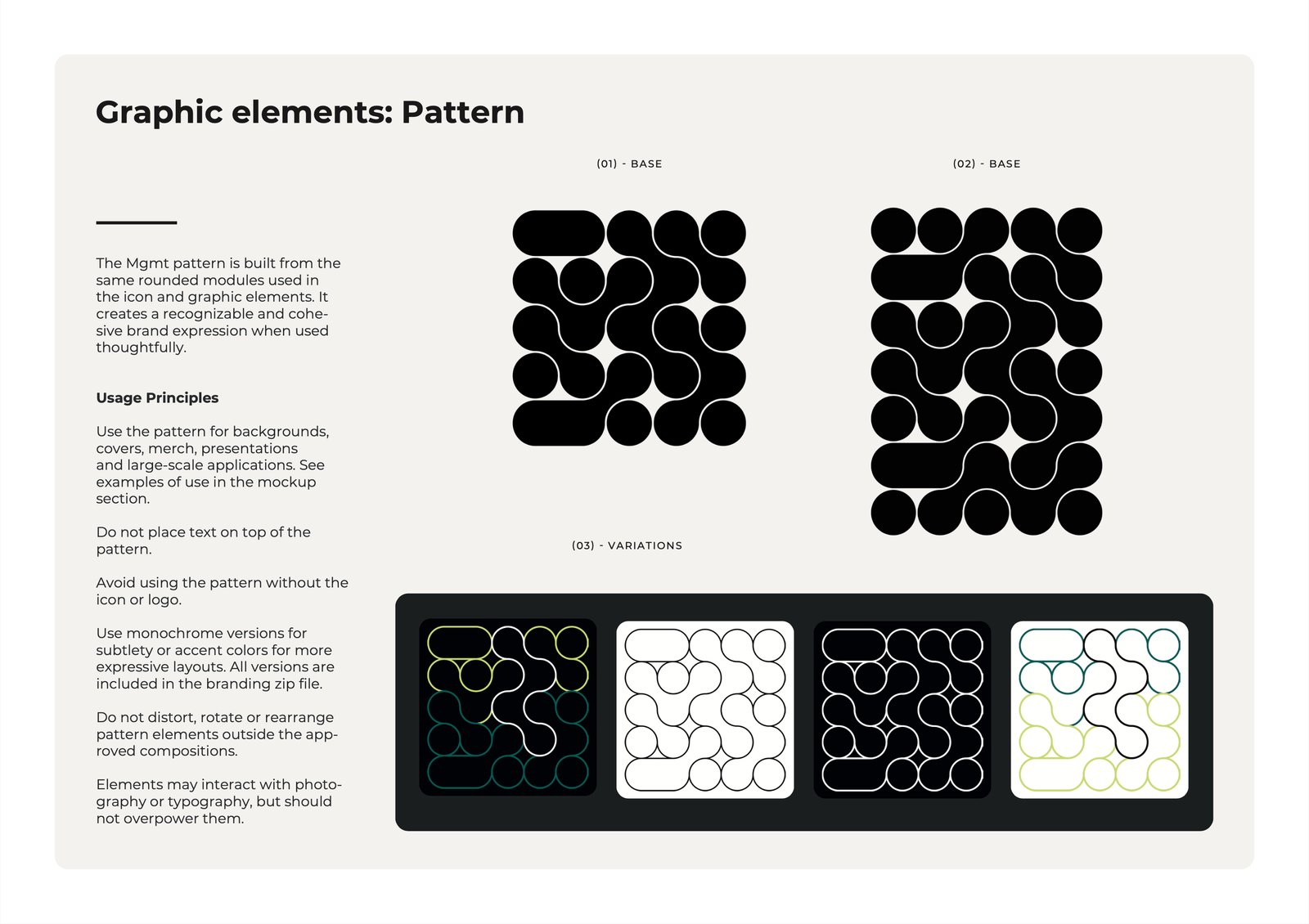
The visual identity was designed to reflect Mgmt’s core character — modern, human and action-oriented — combining clean typography, high contrast and soft, organic graphic forms inspired by connection and flow. A flexible system of accent colors, modular shapes and patterns enables variation while maintaining consistency across applications.
The brand style guide establishes clear rules for usage and scalability, ensuring a consistent expression across both digital and print contexts.
Concrete improvements (before → after)
The previous website was difficult to navigate, visually inconsistent and had limited search visibility. It did not clearly communicate Mgmt’s offering or values, and important information for both clients and candidates was missing or hard to find.
The new identity and website address these issues by:
Introducing a clear page structure and hierarchy, making content easier to scan and understand for both potential clients and job seekers. (See sitemap)
Aligning brand expression and interface design, creating a consistent experience that reflects Mgmt’s expertise and builds immediate trust.
Establishing a search engine-friendly foundation with a 100/100 SEO score (Google Lighthouse), ensuring the site is technically optimized and easy to find via search engines.
Implementing a custom CMS that allows the Mgmt team to independently update their own job listings and cases, making the site a practical and scalable tool for the business.
Presenting Mgmt as forward-thinking and human-centered, which led to very positive feedback from the client and a significantly stronger digital presence.
Thanks to our web and design guru Esther Lindfors 💫
She completely understood the assignment! Could not recommend her enough!
- Zana Niklasson, CEO
Summary
Together, the brand identity and website form a unified digital presence that supports business communication and recruitment, while providing a scalable foundation for future growth and visibility.