DIPY
Digital service MVP
Dipy is part of my and Tea Klaréus’ graduation project – a design project where we developed a digital service from the first idea to a minimum viable product (MVP).
GOAL :
The purpose was to explore how digital design can be used to reduce analysis paralysis, the tendency to get stuck in decision-making, by balancing chance and control in the user experience.
RESULT :
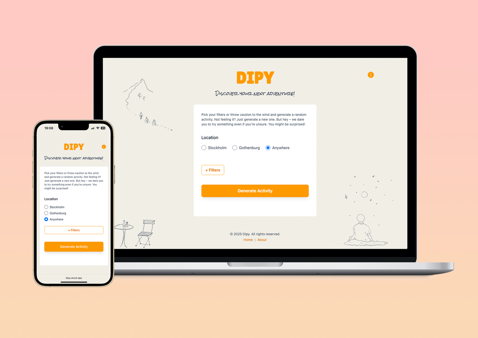
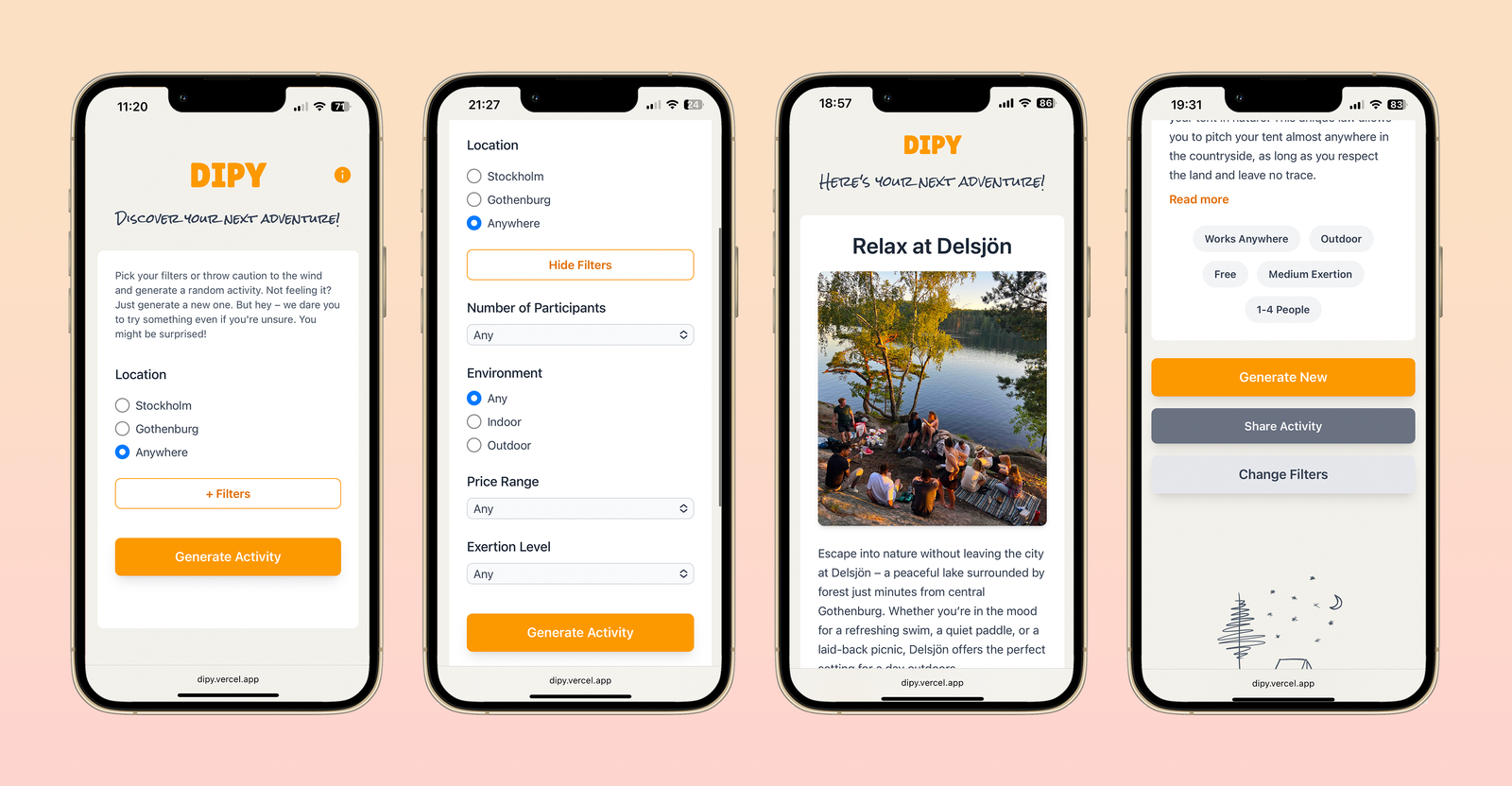
The result was a mobile-first web application that, using location data and elements of chance, generates suggestions for activities nearby. Dipy encourages spontaneity and curiosity, while still giving the user the option to adjust the results through a few intuitive filters.
Year:
2025
Type of work:
MVP of an app
Tags:
UX, UI, User testing, Frontend, Backend
Tools:
Figma, HTML, Tailwind CSS, Js, Node.js (PHP for testing), Vercel, Supabase
Process
Problem definition
In an everyday life where there seem to be more choices than ever, decision-making can easily become passive. We saw a need for a tool that simplifies choosing rather than increasing the number of alternatives. This led us to the following research questions:
- Do randomly generated activities affect users’ willingness to explore new places or break their habits?
- Which design strategies work best to encourage users to accept chance-based suggestions?
Research and insights
The project began with a research phase. We studied existing solutions within activity discovery, random generation and decision support, as well as theories in behavioral design and choice architecture.
Through a combination of desk research, user interviews and market analysis, we identified key needs:
- Users want inspiration rather than planning
- Services should require minimal cognitive effort
- Chance must feel trustworthy, not arbitrary
Based on this, we formulated three guiding design principles:
- Low cognitive load – every decision should be quick and intuitive.
- Progressive control – allow the user to influence the outcome, but only after experiencing the element of chance.
- Immediate action – clear visual hierarchy and a direct link between suggestion and action.
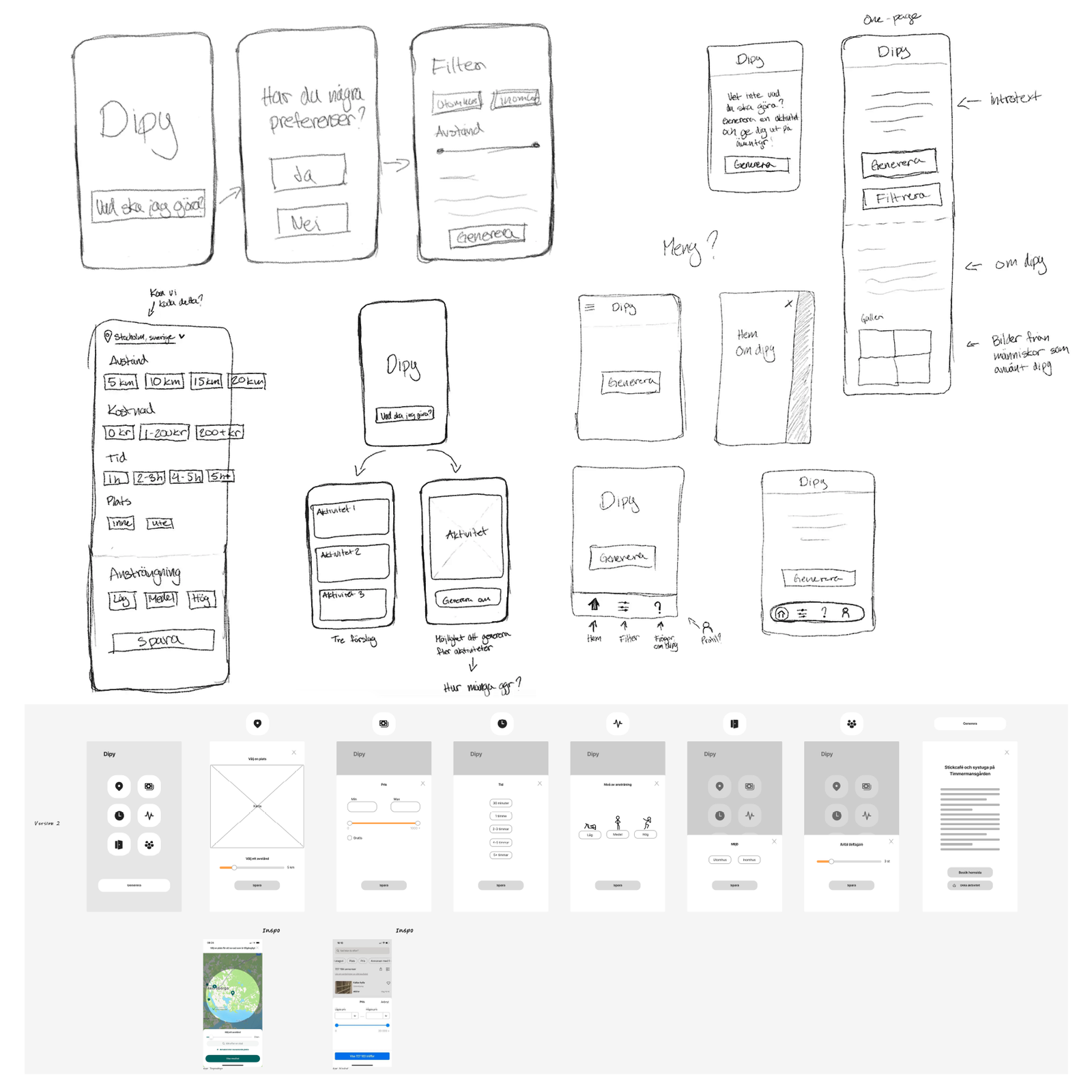
Concept development and process
The project followed an exploratory and iterative workflow where design, prototyping and testing ran in parallel. Early ideas were shaped through sketches, wireframes and design critique. The work focused on creating a flow that minimized friction and encouraged spontaneity – summarized as “Find place → Generate → Explore.”
During the design process, we explored different ways of presenting results, structuring information and integrating filtering. The aim was to find a balance between inspiration and control, and to create a clear and easily navigated experience.
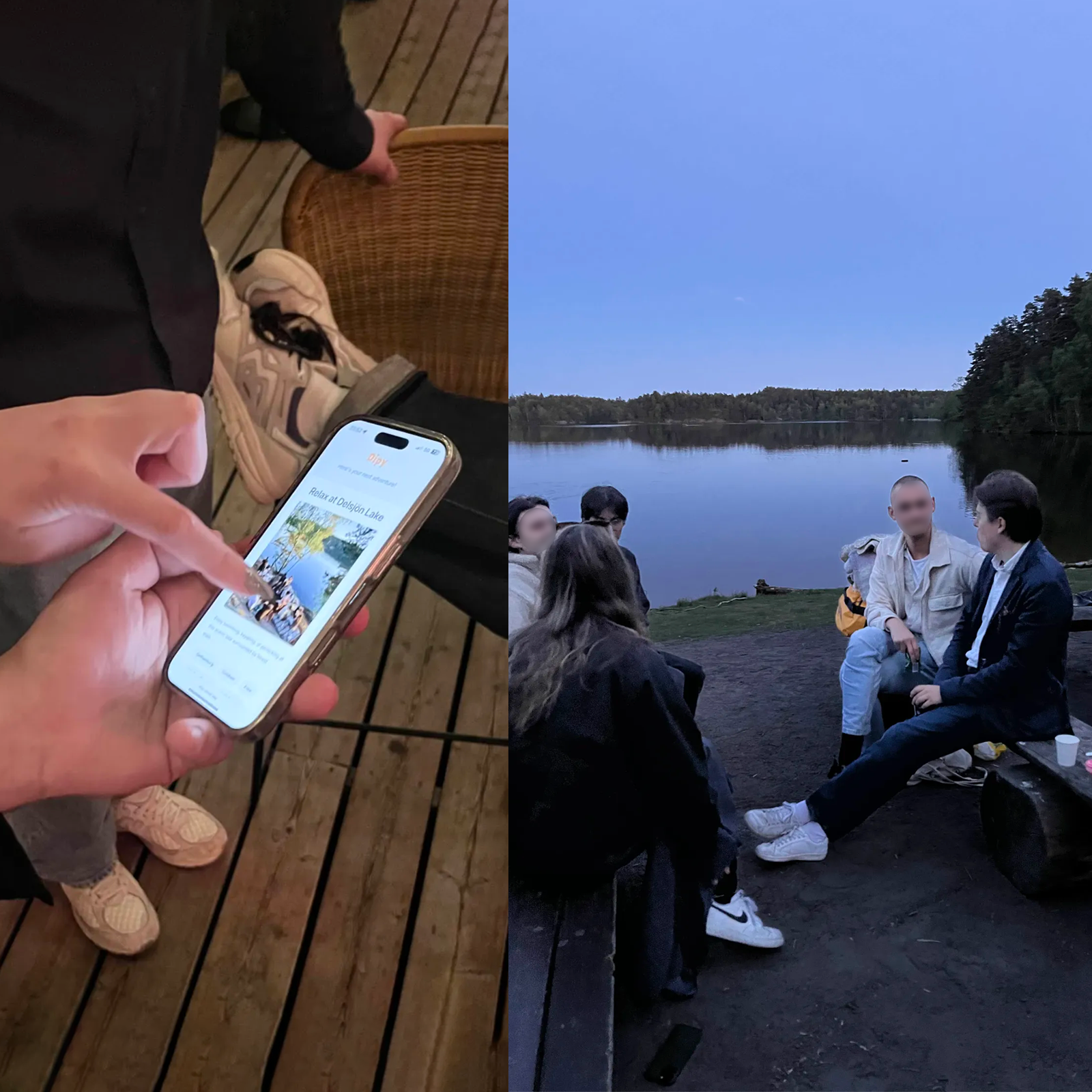
To ensure our assumptions were correct, several user tests were conducted at different stages – from early paper prototypes to clickable Figma flows and working coded versions. The tests combined observations and interviews to examine how users understood the purpose of the service, how randomness affected motivation and trust, and how language, layout and interaction shaped their experience.
The results of each test informed adjustments to the interface, features and content. This continuous cycle of idea, testing and iteration allowed the design to evolve step-by-step – from concept to a functioning, user-centered MVP.
Testing and iteration → Concrete changes
- Clearer context: Several users did not immediately understand the purpose, which led to an introductory text on the start page and a separate information page explaining the concept.
- User-generated content: Test participants wanted the ability to submit their own suggestions. We therefore created a form where activities can be submitted for manual review – a solution that enabled testing without full backend complexity.
- Filtering strategy: Early tests showed that users immediately opened filters, which went against the idea of spontaneity. The filter panel was therefore made collapsible to encourage exploration before filtering.
- Information structure: Long activity descriptions caused frustration while navigating. Collapsible text sections solved this and improved overview and interaction flow.
- Flexibility and sharing: Tests showed a need for more filters (number of participants, activity level) as well as the ability to share activities. A sharing function via the browser’s built-in API was implemented, adding a social dimension to the experience.
Technical structure
To validate the flows in a realistic environment, we developed a functioning MVP alongside the design work.
Technical components:
Frontend: HTML5, Tailwind CSS, JavaScript
Backend: Node.js (Vercel Serverless Functions)
Database and storage: Supabase (PostgreSQL + Storage)
The application fetches location data, filters based on the user’s choices and returns a random but relevant activity suggestion. This is complemented by sharing, onboarding and analytics tracking for further evaluation.
Working practically with development provided a deeper understanding of how technical constraints and opportunities influence design decisions and the user experience.
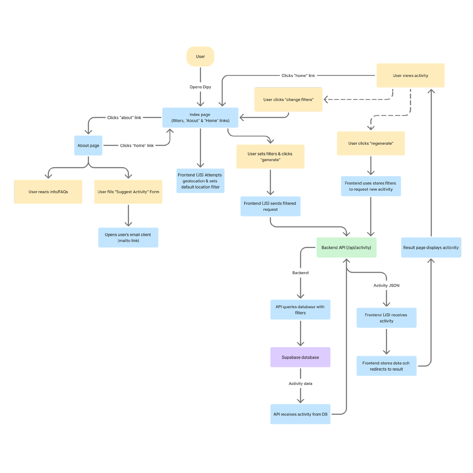
Flowchart. Click for zoomable version.
Results
Delivered outcome
The final solution is a mobile-friendly, web-based application for Gothenburg and Stockholm. The interface is characterized by simplicity, clear visual hierarchy and a low threshold to action. The combination of randomness and optional filtering makes the experience both surprising and relevant. The MVP confirmed our hypothesis that a design combining chance and structured control can reduce analysis paralysis while fostering a desire for exploration.
Reflection
By integrating UX research, interaction design and technical implementation, we gained a deeper understanding of how theory and practice interact in the development of a digital product – from idea to working prototype. The project clearly showed that randomness, when handled correctly, can be a meaningful tool for decision-making and motivation, as long as the user is given the ability to understand and influence the outcome.
The work resulted in several key learnings:
- Randomness as decision support can help users break out of analysis paralysis by offering a concrete, relieving alternative to planning.
- Filtering as balancing control strengthens the sense of relevance without removing spontaneity; users want to influence when needed, but not be forced to.
- Fact-based presentation is perceived as most motivating and trustworthy – concrete and informative descriptions make activities feel more achievable.
Going forward, we see potential to further develop Dipy with features for automated moderation of user-generated content.
Role and responsibility
I shared responsibility with Tea Klaréus throughout the entire project.
My main focus areas were research, test planning, interaction design, information structure and building the final MVP.
Summary
Dipy is a digital service created to inspire spontaneity and reduce analysis paralysis.
Through a research-driven and iterative UX process, we developed a concept that unites simplicity, curiosity and technical precision – from idea to a functioning MVP.